

Font Identification
How to Match a Font: Find Similar Typefaces & Free Alternatives
You have seen it before: the perfect font on a poster, a competitor’s site, or a client’s old brand guide — but it turns out to be a pricey commercial typeface, or you cannot even find its name. Matching a font solves both problems. Matching means two things: first identifying the exact typeface, then finding a visually similar (often free) alternative you can actually use. This guide gives you a repeatable workflow for both.
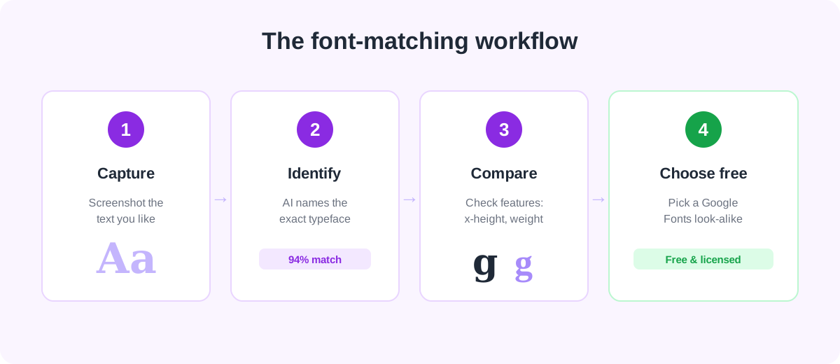
Step 1: Identify the font you want to match
You cannot match what you cannot name. Start by pinning down the original typeface. If the text is a live web element, browser DevTools will read its font-family directly — our guide on how to find what font a website is using walks through every method. If the text is inside an image, a logo, or a screenshot, code inspection will not help; upload the picture to an AI Font Finder instead, which reads the letterforms themselves and returns ranked matches with confidence scores.
For a step-by-step on getting clean, accurate results from a photo, see how to identify a font from an image. Crop tightly, use a high-contrast sample, and include a mix of letters — the more glyph variety, the more reliable the match.
Step 2: Learn the features that make a match
A good match is not about the overall vibe — it is about specific, measurable letterform features. When you compare a candidate alternative to the original, look at these:
- Serifs (or lack of them). Is it a serif or a sans-serif? If serif, are the serifs thin and sharp (modern) or thick and blocky (slab)?
- x-height. The height of lowercase letters relative to capitals. A tall x-height reads very differently from a short one, even in otherwise similar fonts.
- Contrast. The difference between thick and thin strokes. High-contrast faces feel elegant; monoline faces feel modern and even.
- Aperture and terminals. How open the curves of
c,e, andaare, and how strokes end (straight cut, angled, or rounded). - Distinctive glyphs. The
a,g,Q, andRare giveaways — a double-storyaversus single-story, or a looped versus open-tailg, narrows the field fast.
When two fonts agree on x-height, contrast, and those distinctive glyphs, they will read as near-identical in a headline or paragraph — which is exactly what you want in a substitute.
Step 3: Find a free alternative
Once you know the original, the fastest route to a free substitute is to let the tool do the pairing: our font finder surfaces close visual alternatives alongside every identification, and prioritizes free, open-source faces where a good one exists. You can also browse look-alikes directly in the Font Library, which is filterable by style.
Some reliable, royalty-free stand-ins to know about (all on Google Fonts, all licensed for commercial use):
- Instead of Helvetica / Arial → Inter, Roboto, or Work Sans for a clean neo-grotesque feel.
- Instead of Futura → Poppins or Jost for geometric, circular sans-serif shapes.
- Instead of Gotham → Montserrat, which was directly inspired by geometric urban signage.
- Instead of Proxima Nova → Nunito Sans or Mulish for a rounded, humanist geometric look.
- Instead of Times New Roman → PT Serif or Tinos for classic text-serif proportions.
- Instead of Didot / Bodoni → Playfair Display for high-contrast, fashion-forward headlines.
Once you have picked one, dropping it into a site is a two-minute job — see how to add fonts to a website with CSS for the copy-ready snippet, and keep an eye on web font performance so extra weights do not slow your pages down.
Why match instead of just buying the original?
Sometimes you should buy the original — brand consistency matters and licenses are affordable. But matching is the right call when the original is a costly foundry face you only need once, when you need a webfont license the original does not offer, or when you want an open-source font you can self-host without per-pageview fees. Whatever you choose, remember that identifying a font does not grant you the right to use it — always confirm the terms. Our font licensing guide explains the difference between free, commercial, and open-source (OFL) licenses.
Frequently asked questions
Can I match a font from just a photo or a logo?
Yes. Because an AI font finder analyzes the actual letter shapes rather than any underlying code, it works on photos, logos, screenshots, and scanned print — anything the other methods cannot read. Crop tightly around a clear line of text for the best result.
Are free alternatives really close enough to the paid original?
For most body text and many headlines, yes — modern open-source families like Inter, Montserrat, and Playfair Display were designed to compete with commercial faces. For a logo or a wordmark where every curve is scrutinized, you may still prefer the exact original, but a strong free match is usually indistinguishable in running text.
Is it legal to use a look-alike font instead of the original?
Yes. Typeface *designs* are generally not protected the way the font *software* is, so using a different, legitimately licensed font that looks similar is fine. What you cannot do is copy the original font file, or reproduce a trademarked logo. Stick to fonts you have licensed (Google Fonts are free for commercial use) and you are safe.
Spotted a font you love?
Upload any image and let our AI identify the typeface in seconds — free, no sign-up.
Try the AI Font Finder