

Typography
The Best Fonts for Logos in 2026 (And How to Identify Any Logo Font)
A logo is often the first — and sometimes only — piece of typography a customer notices about your brand. The right typeface signals whether you are playful or premium, technical or traditional, in a fraction of a second. This guide breaks down the five font families behind strong logos in 2026, names free options for each, and shows you how to identify the exact font in any logo you admire.
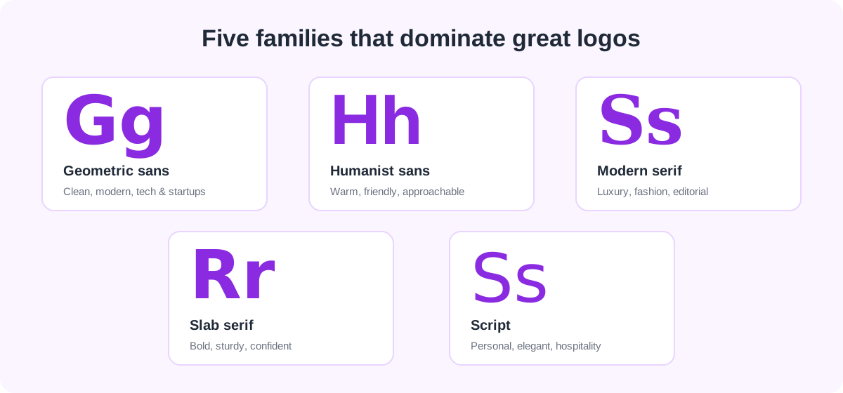
1. Geometric sans-serif — modern & confident
Built from clean circles and straight lines, geometric sans-serifs feel modern, efficient, and forward-looking — which is why they dominate tech, SaaS, and startup branding. Think of the crisp, circular o and single-story a. Free options that nail this style include Poppins, Montserrat, and Jost. Use a heavier weight and tighten the letter-spacing slightly for a wordmark that feels solid at any size.
2. Humanist sans-serif — warm & approachable
Humanist sans-serifs soften the geometry with subtle stroke variation and open shapes drawn from handwriting, making a brand feel friendly and trustworthy — great for healthcare, education, and consumer apps. Inter, Work Sans, and Mulish are excellent free choices. They also double as superb interface and body fonts, so your logo and your product can share one family.
3. Modern serif — premium & editorial
When you want to signal luxury, heritage, or editorial authority, a high-contrast modern serif delivers. The dramatic thick-to-thin strokes read as fashion, beauty, and premium lifestyle. Playfair Display and Cormorant are the go-to free faces here. If you are weighing this against a cleaner look, our guide to serif vs. sans-serif explains what each signals to your audience.
4. Slab serif — bold & sturdy
Slab serifs wear thick, block-like serifs that project strength and reliability — a favorite for coffee brands, sports, and anything that wants to feel dependable and a little retro. Try Zilla Slab, Arvo, or Bitter. Slabs hold up beautifully in small sizes and on merchandise, where thin serifs would disappear.
5. Script — personal & elegant
Script fonts mimic handwriting or calligraphy, adding personality, warmth, or luxury — think hospitality, beauty, and artisan food brands. Use them sparingly and pair them with a simple sans for balance. Free options include Dancing Script, Pacifico, and the elegant Great Vibes. Because scripts vary wildly, they are also the hardest to name by eye — which brings us to identification.
How to identify the font in any logo
See a logo whose type you love? Because logos are almost always flattened into an image — a PNG, an SVG, or a photo — you cannot inspect them with browser DevTools. Instead, screenshot the logo, crop tightly around the lettering, and upload it to the AI Font Finder. It reads the letterforms directly and returns the most likely typeface plus close alternatives. For the full method, see how to identify a font from an image, and for the stories behind well-known marks, read our roundup of famous brand fonts.
One important caveat: many logos are *custom-drawn* or heavily modified from a base font, so an exact match is not always possible. When that happens, an identifier will surface the closest relatives — which is often all you need to recreate the feel in your own original design.
Quick tips for choosing a logo font
- Legibility first. Your logo must be readable on a phone screen and a billboard alike. Test it tiny before you commit.
- Limit yourself to one or two fonts. A single distinctive face — or a font pair — keeps a mark cohesive. See our best font pairings for combinations that work.
- Check the license. Confirm the font is cleared for commercial and logo use before you ship it; our licensing guide explains what to look for.
- Make it distinct. Avoid the default system fonts your competitors use — a little character goes a long way in a crowded market.
- Design in vector. Build the final logo from vector letterforms so it stays razor-sharp at every size.
Frequently asked questions
What is the most popular font for logos?
There is no single winner, but geometric and neo-grotesque sans-serifs — the family that includes Helvetica, Futura, and their free cousins Montserrat and Poppins — appear in more major logos than any other style because they read as clean, modern, and neutral. The best choice always depends on your brand’s personality.
Can I use a free Google Font in my company logo?
Yes. Fonts on Google Fonts are released under open licenses (usually the SIL Open Font License) that permit commercial use, including in logos. You still cannot copy someone else’s trademarked logo, but building an original mark with a free font is completely fine.
How do I find out what font a specific logo uses?
Take a clean screenshot of the logo, crop tightly around the text, and upload it to the AI Font Finder. It analyzes the letter shapes and returns the closest matching typefaces. Keep in mind that some logos use custom lettering, so you may get the nearest relative rather than an exact hit.
Spotted a font you love?
Upload any image and let our AI identify the typeface in seconds — free, no sign-up.
Try the AI Font Finder